

 1 / 8
1 / 8
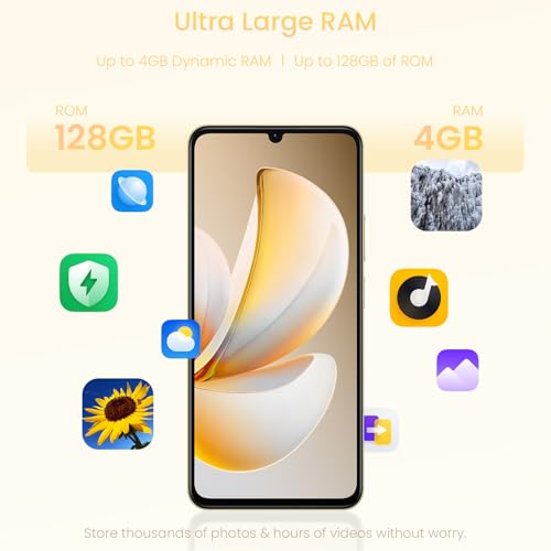
realme Note 70T 4G Smartphone 4+128GB Gold | 6.75 inch Screen, 90Hz Display, 6000mAh Battery, 32MP Camera, Powerful Octa-core Processor, ArmorShell Protection, IP54
Have a question or ready to order? Leave your details and we’ll contact you to confirm everything.
Request a call
- 01Personal assistanceWe’ll answer questions about this item.
- 02Order by phoneConfirm details directly with our team.
Details
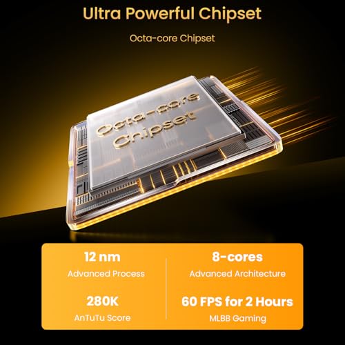
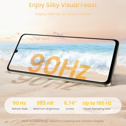
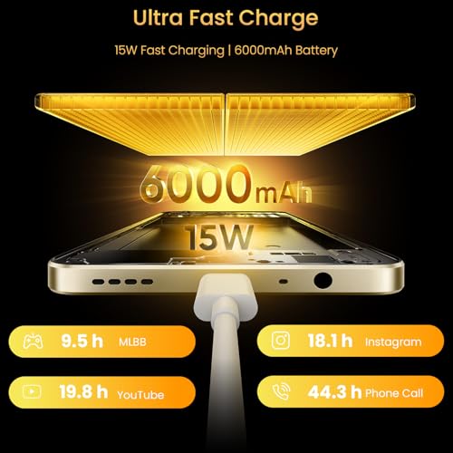
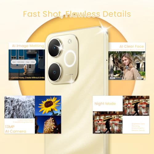
6.75 inch 90Hz Display: The 6.75 inch screen with a 90Hz refresh rate delivers exceptionally smooth visuals, making scrolling through social media, streaming videos, and daily navigation feel more responsive and enjoyable 6000mAh Long-lasting Battery: Equipped with a robust 6000mAh battery, it provides reliable long-lasting power to easily get through a full day of heavy usage, including gaming, video calls, and frequent app use, without needing a recharge 32MP Camera: The 32MP camera captures sharp, clear photos in various lighting conditions—whether it’s bright daylight or dim indoor settings—perfect for preserving daily moments like family gatherings, outdoor outings, or casual snapshots Powerful Octa-core Processor: Boasting a powerful octa-core processor, it handles multitasking with ease, allowing you to switch between apps, browse the web, and run light games smoothly without lag or slowdowns ArmorShell Protection & IP54: Designed to withstand daily wear and tear, it features durable ArmorShell Protection and an IP54 rating. This means it’s resistant to dust, accidental water splashes (like rain or spilled drinks), and minor bumps, keeping your device safe and functional through your busy lifestyle .aplus-v2 .aplus-content-wrapper { position: relative; overflow: hidden; } .aplus-v2 .container-with-background-image { width: 100%; height: 100%; background-repeat: no-repeat; background-size: cover; } function logShoppableMetrics(moduleName, showsAddToCart) { if (window.ue && window.ue.count) { window.ue.count("aplus:shoppable:" + moduleName + ":addToCart", showsAddToCart ? 1 : 0); } } From the brand /* * Used when device = desktop * Configured in: configuration/brazil-config/global/brand-story.cfg */ /* Because the carousel is implemented as an ol list, any lists in the card text will have a secondary list style (letters). This will give an incorrect appearance to viewers, so we set all lists to the primary list style (numbers). */ .aplus-brand-story-card ol li { list-style: decimal; } /* Top level containers */ .aplus-module .apm-brand-story-hero { -moz-box-sizing: border-box; -webkit-box-sizing: border-box; box-sizing: border-box; width: 1464px; height: 625px; background-color: #fff; } .aplus-module .apm-brand-story-card { -moz-box-sizing: border-box; -webkit-box-sizing: border-box; box-sizing: border-box; width: 362px; height: 453px; background-color: var(--aok-sfs-color-page-primary-normal-bg, #fff); } .apm-brand-story-hero, .apm-brand-story-card { -moz-box-sizing: border-box; -webkit-box-sizing: border-box; box-sizing: border-box; position: relative; width: 100%; height: 100%; float: none; } .aplus-module.brand-story-card-1-four-asin .apm-brand-story-card { /* Only 12px to account for image cell border */ padding: 12px; } /* Full background image (Hero 1 & Card 2) */ .aplus-module .apm-brand-story-background-image { -moz-box-sizing: border-box; -webkit-box-sizing: border-box; box-sizing: border-box; overflow: hidden; position: absolute; width: 100%; height: 100%; } .aplus-module .apm-brand-story-background-image img { display: block; width: 100%; height: 100%; object-fit: cover; } /* Card 1 small images */ .aplus-module .apm-brand-story-image-grid { -moz-box-sizing: border-box; -webkit-box-sizing: border-box; box-sizing: border-box; padding: 0px; margin: auto; display: flex; flex-flow: row wrap; } .aplus-module .apm-brand-story-image-grid .apm-brand-story-image-grid-item { /* Use content-box to ensure image size matches editor schema */ -moz-box-sizing: content-box; -webkit-box-sizing: content-box; box-sizing: content-box; padding: 0px; margin: 2px; width: 162px; height: 185px; border: 1px solid var(--aok-sfs-color-page-inverse-normal-border, #fff); } .aplus-module .apm-brand-story-image-grid .apm-brand-story-image-grid-item .apm-brand-story-image-link { display: block; width: 100%; height: 100%; padding: 2px; } .aplus-module .apm-brand-story-image-grid .apm-brand-story-image-grid-item .apm-brand-story-image-link .apm-brand-story-image-img { display: block; width: 100%; height: 100%; object-fit: cover; } /* Card 3 logo image */ .aplus-module .apm-brand-story-logo-image { -moz-box-sizing: content-box; -webkit-box-sizing: content-box; box-sizing: content-box; height: 145px; margin: 0px 4px; padding: 20px; padding-bottom: 0px; } /* Text overlays */ .aplus-module .apm-brand-story-text-bottom { -moz-box-sizing: border-box; -webkit-box-sizing: border-box; box-sizing: border-box; position: absolute; bottom: 13px; left: 13px; } .aplus-module .apm-brand-story-hero .apm-brand-story-text-bottom { background-color: rgba(0,0,0,0.6); color: #fff; padding: 13px 65px 13px 13px; /* accounts for overlap of first card */ width: 437px; } .aplus-module.brand-story-card-2-media-asset .apm-brand-story-text-bottom { background-color: rgba(255,255,255,0.6); color: #000; padding: 13px; width: 336px; } .aplus-module.brand-story-card-1-four-asin .apm-brand-story-text { margin-top: 8px; padding-left: 2px; padding-right: 2px; } .aplus-module.brand-story-card-1-four-asin .apm-brand-story-text.apm-brand-story-text-single { margin-top: 20px; } .aplus-module.brand-story-card-1-four-asin .apm-brand-story-text h3 { white-space: nowrap; overflow: hidden; text-overflow: ellipsis; } .aplus-module .apm-brand-story-slogan-text { -moz-box-sizing: content-box; -webkit-box-sizing: content-box; box-sizing: content-box; margin: 0px 4px; padding: 20px; } .aplus-module .apm-brand-story-faq { -moz-box-sizing: content-box; -webkit-box-sizing: content-box; box-sizing: content-box; padding-top: 10px; } .aplus-module .apm-brand-story-faq-block { margin: 0px 10px; padding: 10px; } .aplus-v2 .apm-brand-story-carousel-container { position: relative; } .aplus-v2 .apm-brand-story-carousel-hero-container, .aplus-v2 .apm-brand-story-carousel-hero-container > div { position: absolute; width: 100%; } /* Ensuring the carousel takes only the space it needs. The sizes need to be set again on the absolutely positioned elements so they can take up space. */ .aplus-v2 .apm-brand-story-carousel-container, .aplus-v2 .apm-brand-story-carousel-hero-container { height: 625px; width: 100%; max-width: 1464px; margin-left: auto; margin-right: auto; overflow: hidden; } .aplus-v2 .apm-brand-story-carousel-hero-container, .aplus-v2 .apm-brand-story-carousel-hero-container > div { height: 625px; } .aplus-v2 .apm-brand-story-carousel.a-carousel-container { padding: 0px; } /* This centers the carousel vertically on top of the hero image container and after the logo area (125px). Margin-top = (heroHeight - cardHeight - logoAreaHeight) / 2 + logoAreaHeight */ .aplus-v2 .apm-brand-story-carousel .a-carousel-row-inner { margin-top: 149px; } /* Cards need to have a width set, otherwise they default to 50px or so. All cards must have the same width. The carousel will resize itself so all cards take the width of the largest card. The left margin is for leaving a space between each card. */ .aplus-v2 .apm-brand-story-carousel .a-carousel-card { width: 362px; margin-left: 30px !important; } /* styling the navigation buttons so they are taller, flush with the sides, and have a clean white background */ .aplus-v2 .apm-brand-story-carousel .a-carousel-col.a-carousel-left, .aplus-v2 .apm-brand-story-carousel .a-carousel-col.a-carousel-right { padding: 0px; } .aplus-v2 .apm-brand-story-carousel .a-carousel-col.a-carousel-left .a-button-image, .aplus-v2 .apm-brand-story-carousel .a-carousel-col.a-carousel-right .a-button-image { border: none; margin: 0px; } .aplus-v2 .apm-brand-story-carousel .a-carousel-col.a-carousel-left .a-button-image .a-button-inner, .aplus-v2 .apm-brand-story-carousel .a-carousel-col.a-carousel-right .a-button-image .a-button-inner { background: #fff; padding: 20px 6px; } .aplus-v2 .apm-brand-story-carousel .a-carousel-col.a-carousel-left .a-button-image .a-button-inner { border-radius: 0px 4px 4px 0px; } .aplus-v2 .apm-brand-story-carousel .a-carousel-col.a-carousel-right .a-button-image .a-button-inner { border-radius: 4px 0px 0px 4px; } <img alt="1" src="https://m.media-amazon.com/images/S/aplus-media-library-service-media/b2992318-bdaf-4ff8-9415-05191a9f2406.__CR0,0,1466,626_PT0_SX1464_V1___.jpg"/> <img alt="3" src="https://m.media-amazon.com/images/S/aplus-media-library-service-media/65971dbc-25bd-4b8f-908a-e8d845db51fe.__CR4,0,362,453_PT0_SX362_V1___.jpg"/> <img alt="4" src="https://m.media-amazon.com/images/S/aplus-media-library-service-media/7d6686f0-f0c2-4a2f-b986-a2fff36d5dd7.__CR4,0,362,453_PT0_SX362_V1___.jpg"/> <img alt="5" src="https://m.media-amazon.com/images/S/aplus-media-library-service-media/99ef3652-3593-4e89-9f88-5c8fdb819e1b.__CR4,0,362,453_PT0_SX362_V1___.jpg"/> <img alt="6" src="https://m.media-amazon.com/images/S/aplus-media-library-service-media/39529387-ca3b-41d4-9f33-7938e7bea70c.__CR4,0,362,453_PT0_SX362_V1___.jpg"/> <img alt="7" src="https://m.media-amazon.com/images/S/aplus-media-library-service-media/f6684578-b14b-41dc-a3ba-2260a74e47e6.__CR4,0,362,453_PT0_SX362_V1___.jpg"/> <img alt="8" src="https://m.media-amazon.com/images/S/aplus-media-library-service-media/7d23e43a-c48e-4240-b0f1-5d7e8d75d609.__CR4,0,362,453_PT0_SX362_V1___.jpg"/> <img alt="9" src="https://m.media-amazon.com/images/S/aplus-media-library-service-media/2e123d5d-7f50-47b1-a4e9-185180c27520.__CR4,0,362,453_PT0_SX362_V1___.jpg"/> (function(f) {var _np=(window.P._namespace("BrandStoryAplusModule"));if(_np.guardFatal){_np.guardFatal(f)(_np);}else{f(_np);}}(function(P) { P.when('brand-story-carousel').execute("init-brand-story-carousel", function (init) { init(); }); }));